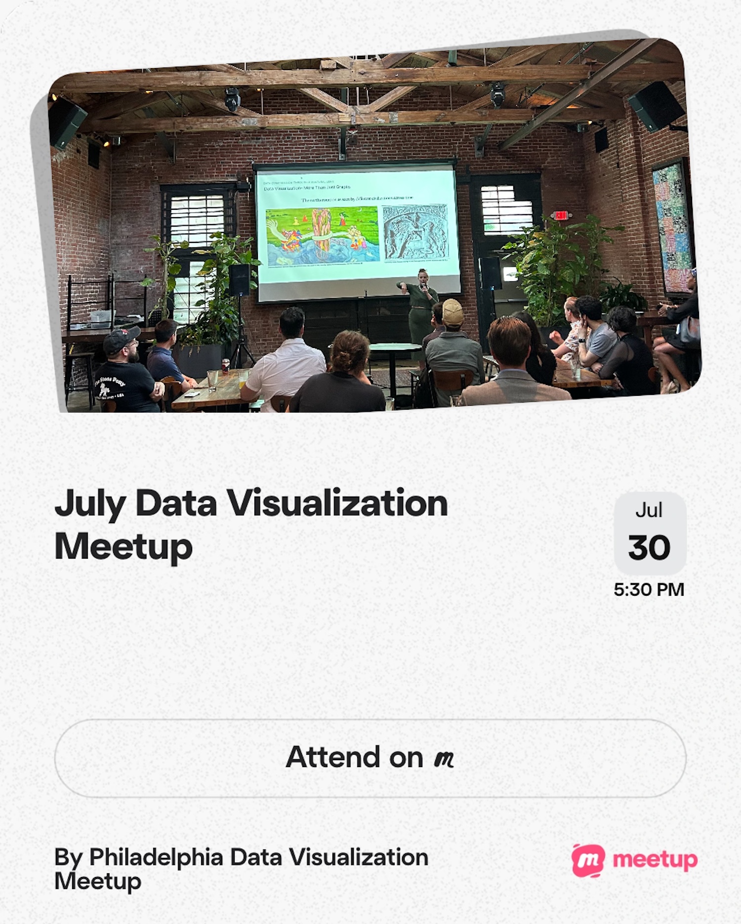
Brief talk about data visualization to share public-facing data visualization projects (see links below!) and share preliminary research on the state of philanthropic funding in journalism.
Resources
- TidyTuesday R data viz database on Notion
- The lack of accessibility in the TidyTuesday learning community
- My collaborator Liz Hare authored a chapter in the Urban Institute’s Do No Harm Guide on Centering Accessibility in Data Visualization. The chapter is titled Writing Alt Text to Communicate the Meaning in Data Visualizations. Check it out!
- Interactive Center City District SIPS Map
- Graphics for Kensington Voice accountability piece
- Upcoming report on philanthropic funding for journalism