This year I’m excited to be attending NICAR 2025 which seems to be a wildly popular U.S. conference for data journalists. 🥳📊
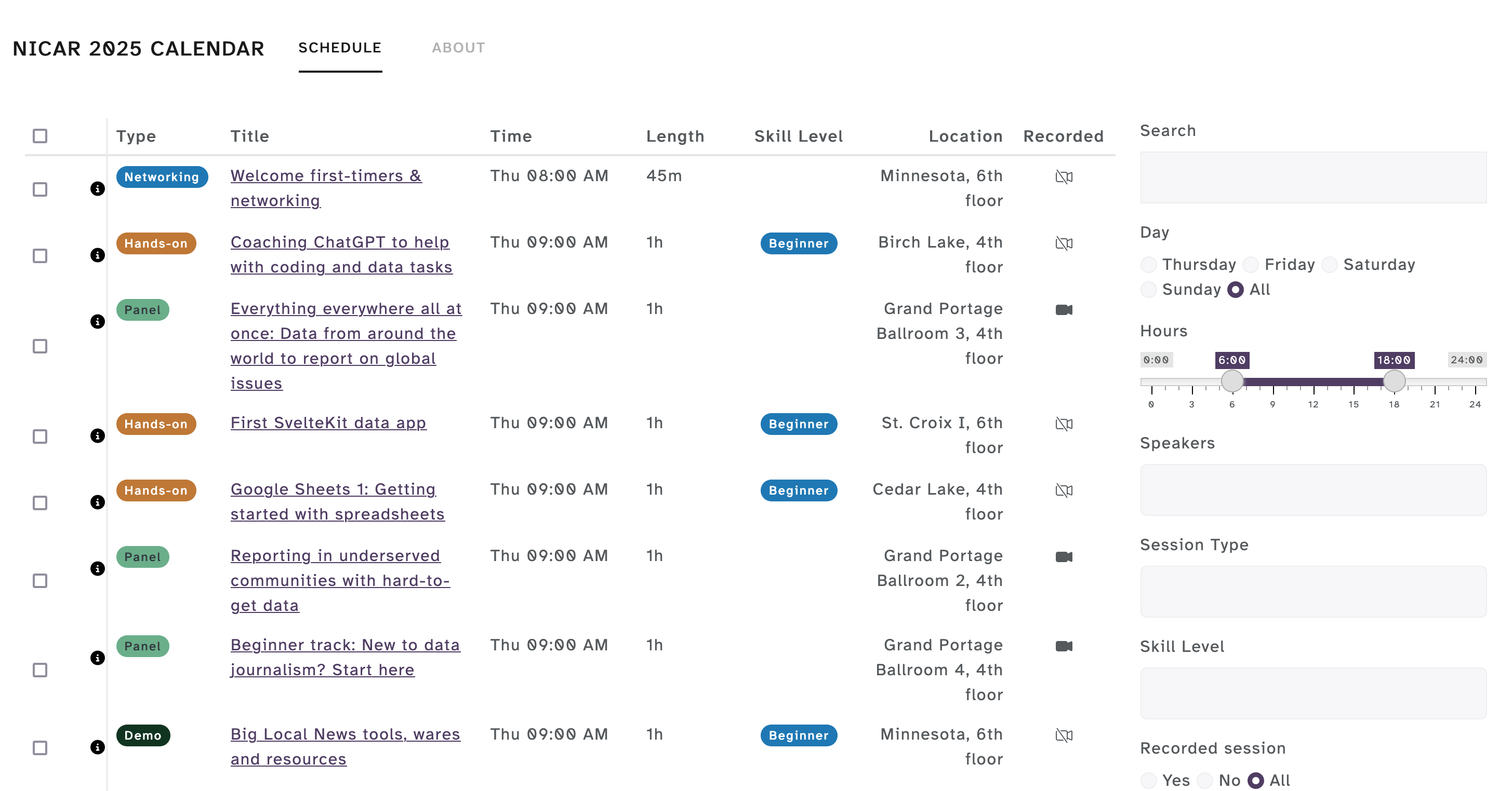
I built a build-your-own calendar tool to help me explore, find, and export a custom selection of sessions to a calendar file. My hope is you find it helpful too! 👇🏽
If you happen to see me at NICAR, please say hello! It will be my first time attending, and I’ll be so happy to meet new folks. If you’re curious about my other journalism projects, I’ve curated them in a list below.
Backstory
As soon as nonprofit Investigative Reporters and Editors (IRE) posted the official schedule of 213+ sessions and workshops I felt like I do when I’m deciding what ice cream flavor I want – they all look great and, how was I going to decide???. I knew some tough decisions would have to be made!
Seeing this list immediately brought memories to RStudio Global 2021, which took place virtually all over the world for a continuous 24 hours. So many of us were trying to make sense of the long list of sessions, both when the sessions were happening (across different timezones) and which were in conflict with one another.
The Twitter #RStats community (8 different people!) really came together to crowdsource a solution that used R (of course) to take in these sessions and produce a calendar file that we could import into our personal calendars. By the end of this community effort, Garrick Aden-Buie had built a Shiny app that I adapted for NICAR 2025!
This is my first time building a Shiny app, and it seems like this one may be too complex for shinylive, so I opted to host on shinyapps.io. I have my fingers crossed that the free tier will be enough to handle the traffic! 🤞
Other journalism projects
- Revealing Room for Improvement in Accessibility within a Social Media Data Visualization Learning Community – Data visualization accessibility talk revealing a lack of accessibilty after scraping alternative (alt) text from data viz shared on Twitter as part of the #TidyTuesday social project.
- TidyTuesdayAltText – An R data package with the goal of providing insight into the alternative (alt) text accompanying the data visualizations shared on Twitter as part of the TidyTuesday social project.
- TidyTuesday databases on Notion – searchable TidyTuesday databases that democratize data visualization resources shared by the #RStats Twitter community between 2018-2021.
- Resources for Data Viz Accessibility – A selection of general and R-specific resources on how and why to make accessible data visualizations.
- Considering Equity in Data Visualization – Slides for an interactive presentation summarizing a selection of the principles including in the Urban Institute’s series of Do No Harm guides, which focus on how to incorporate principles of equity into data collection, visualization, and communication.
- Philly Center City District SIPS: An Interactive Map – An interactive map showing restaurants participating in CCD Sips 2022 & a companion R tutorial on webscraping, geocoding, and map-making
- Creating the Philly Center City SIPS Interactive Map – Step-by-step tutorial on using webscraping, geocoding, and Leaflet in R to produce an interactive map.
- useR!2021 Cost Conversion Tool – Cost-conversion tool, created for the useR!2021 Conference, that leverages Gross Domestic Product and Purchasing Power Parity to adapt sponsorship and registration fees according to the country of residence.
- Visualizing the Inside Journey of Recovery from Opioid Use Disorder – Code for Philly 2020 Opioid Data Hackathon project to better understand recovery from opioid use disorder. This involved conducting interviews with folks impacted by opioid use disorder in order to better understand the myriad challenges this community faces in accessing healthcare, and creating media to illustrate the complexity.